CinemaSnacks
CinemaSnacks is an app designed for movie-goers. Aiming to make the process of ordering snacks at the theater easy, timely, and efficient. With access to full menus at partnering theaters. CinemaSnacks was designed for both casual and frequent movie-goers looking to make their cinema experience more enjoyable.
The Breakdown
So here’s the problem, Movie-goers want to get the most out of their movie enjoyment while at the theater by minimizing how often they’d have to leave to get more snacks.
-
Design an app that would allow both casual and frequent movie-goers to order snacks at the theater for either delivery/pickup.
-
Lead UX Designer and Art Director from concept to delivery
-
As part of that process I completed the following tasks:
Conduct user interviews
Wireframe (paper/digital)
Prototype (low/high-fidelity)
Conduct usability studies
Iterate on designs based on feedback
phase I
Getting Started
Before jumping into designing, I needed to take the time to consider what the user needs were. From there I could then craft meaningful solutions to meet those needs with the CinemaSnacks app. Understanding movie-goer pain points from my research was crucial to drafting personas and user journey maps. They were the foundational building blocks to the entire design process.
-
I conducted interviews and created empathy maps to understand the users I’m designing for and their needs. A primary user group identified through research was movie-goers who don’t want to leave their seats at the theater to get more snacks.
This user group confirmed initial assumptions about CinemaSnacks target users, but research also revealed that wanting to coordinate a pickup time was another factor that influenced the design of this app.
-
FOMO: Movie-goers don’t want to leave their seats once the movie starts
Time: Waiting in line at the lobby has the potential to keep a movie-goer from seeing key parts of the film
Accessibility: Competitive apps for movie theaters don’t always come equipped with accessibility in mind
Phase II
Initial Designs &
Usability Studies
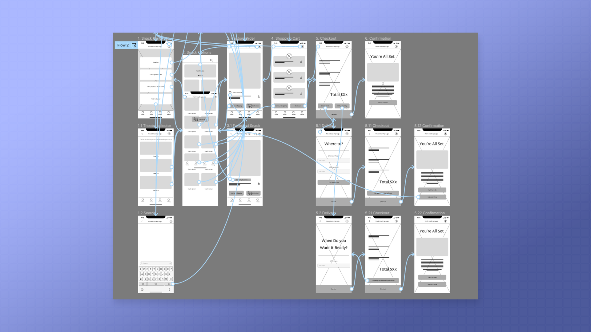
I began the design process with paper wireframes. They allowed me to come up with many ideas before deciding what might work best for the user. From there, I digitized those wireframes in Figma, setting them up as a low-fidelity prototype.
Using the low-fidelity prototype as the focus, I conducted 2 usability studies with my peers, with the studies helping me understand what aspects of the app needed refining.
-
Taking the time to draft iterations of each screen of the app on paper ensured that the elements that made it to digital wireframes would be well-suited to address user pain points.
-
These wireframes were the next stage of the design process and based on feedback from the user research.
-
Using the completed set of digital wireframes I created a low-fidelity prototype, with the primary user flow centered around ordering snacks for review in a usability study.
-
Round 1 Findings
Initial Navigation was confusing
Pickup/delivery features needed to be more obvious
There was a need for a search feature
Round 2 Findings
Button functionality needed refinement
Update menu variations
Phase III
Full Design With
Accessibility Considerations
Taking the low-fidelity prototypes into high-fidelity prototypes was the last step in the mobile build. I mocked up designs I thought might help with an app like this. A darker theme to not distract other movie-goers while keeping the flow simple for faster navigation.
Before finalizing everything, it was worth taking the time to check my design for unconscious biases. I needed to consider what accessibility options would be essential for everyone using the CinemaSnacks app.
-
The final high-fidelity prototype presented cleaner user flows for ordering snacks and checkout. It also met user needs for a pickup or delivery options.
-
Provided access to users who are vision impaired through adding alt text to images as well as high contrast options.
Used icons to help make navigation easier.
Used detailed imagery for snack options to help all users better understand the designs.
Phase IV
Desktop Build
After completing the mobile build, I repeated the ux design process using Adobe XD as the program of choice to build out a desktop variant of the CinemaSnacks app. Keeping in mind that the user’s journey for purchasing snacks ahead of time should be as close as possible to the app. The larger screen allowed me to fit more information within the UI, and provide a familiar brand design from the existing mobile app experience.
Impact:
The app makes CinemaSnacks users feel like the design kept their needs in mind and created a seamless solution for ordering snacks at the movies.
Personal Takeaways:
While designing the CinemaSnacks app, I learned that the first ideas for the app are only the beginning of the process. Usability studies and peer feedback influenced each iteration of the app’s designs.


